[2023.03.08] 12. display: grid
2023. 3. 8. 17:57ㆍDev./CSS

🔍 display 속성 중 grid에 대해 정리.
grid
자식 요소들이 컨테이너 안 공간을 맞추기 위해 크기를 키우거나 줄이는 방법
부모요소를 grid-container 자식요소를 grid-item
웹페이지를 위한 2차원 레이아웃(x축, y축) 시스템
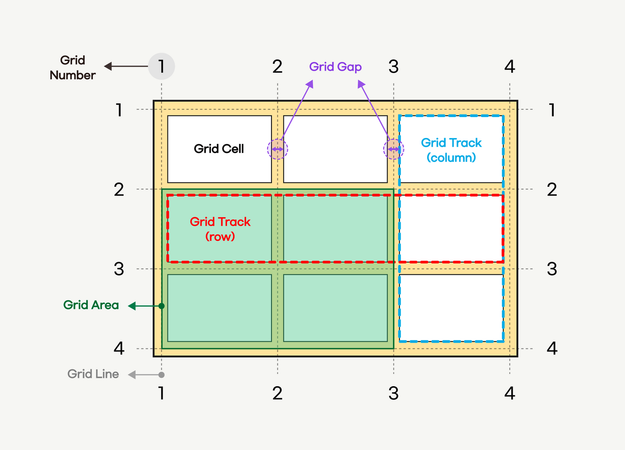
grid-container 속성
아래의 속성들은 grid-container(부모 요소)에서 사용되는 속성이다.
grid-template-columns
- 열방향 그리드 트랙의 사이즈 설정
grid-template-rows
- 행방향 그리드 트랙의 사이즈 설정

💡새로운 단위 fr
- fraction: 분수
- 컨테이너를 분할
- grid 컨테이너 안에서 트랙의 비율을 지정해주는 유연한 길이 단위
- 1fr 1fr 1fr은 1:1:1 의 비율을 의미함
grid-template-areas

그리드 에어리어를 설정함으로써 아이템들이 가지는 공간을 합치거나 나눌 수 있다.
See the Pen Untitled by astinaus (@astinaus) on CodePen.
함수
- repeat()
- row 혹은 column 방향으로 그리드 트랙의 사이즈를 좀 더 간단한 형태로 표현하도록 도와주는 함수.
- 함수에 전달하는 첫번째 인자는 반복 횟수, 두번째 인자는 반복할 값.
- minmax()
- 그리드에서 최소와 최대 사이의 범위를 설정.
- 최솟값과 최댓값을 의미하는 두가지 인자를 가짐.
- min보다 크거나 같고, max보다 작거나 같은 크기 범위를 정의.
auto-fill & auto-fit
- repeat 함수를 사용할 때, 반복되는 카운트를 고정하지 않고 컨테이너의 넓이에 따라
가능한 많은 그리드 컬럼을 배치하고 싶다면 사용하는 키워드 값. - auto-fill: 가능한 많은 셀들을 만듦. 빈 공간이 생김
- auto-fit: 그리드 컨테이너 내부에 공간이 남을 경우, 그 공간을 각 셀들이 나눠가짐.
gap
셀과 셀 사이의 간격 설정.
복잡한 레이아웃에서 margin 대신 편리하게 간격 설정 가능
align-content
- 그리드 콘텐츠의 수직(열) 정렬
- 그리드 콘텐츠의 세로 높이가 그리드 컨테이너보다 작아야 함.
- stretch, center, start, end, space-around, space-between, space-evenly
justify-content
- 그리드 콘텐츠의 수평(행) 정렬
- 그리드 콘텐츠의 가로 높이가 그리드 컨테이너보다 작아야 함.
- stretch, center, start, end, space-around, space-between, space-evenly
align-items
- 직계 자식에 대한 수직(열) 정렬을 모두 동일하게 준다.
- stretch, center, start, end
justify-items
- 직계 자식에 대한 수평(행) 정렬을 모두 동일하게 준다.
- stretch, center, start, end
grid-item 속성
아래 속성은 grid-item(자식 요소)에서 사용하는 속성
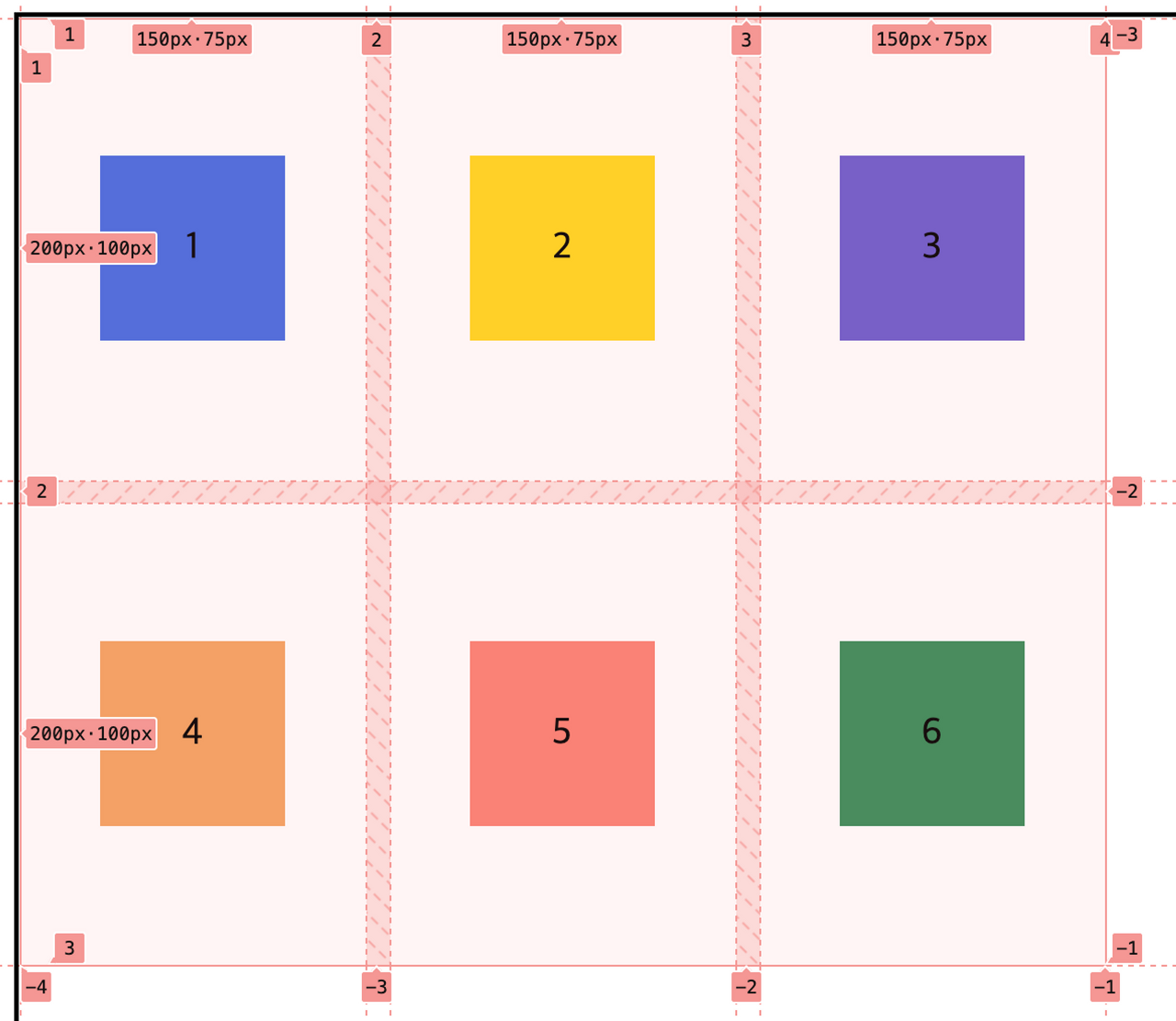
grid-area
grid-template-areas 와 함께 사용할 수도 있고, 아이템에 grid-area를 단독적으로 사용할 수도 있다.
  grid-row-start: 1; /* 1 */
  grid-row-end: 2; /* 3 */
  grid-column-start: 1; /* 2 */
  grid-column-end: 4; /* 4 */


  grid-row: 1/2;
  grid-column: 1/4;


  grid-area: 1/1/2/4;

grid-area: 1/1/1/span 3;💡span
- span의 사전적 의미: ‘한 뼘’, ‘~을 채우다’
- 그리드에서 행과 열을 병합할때 span 키워드를 사용한다.
z-index
grid 안에서 z-index 속성으로 화면에 보여지는 우선순위를 설정 가능.
position 속성을 사용하지 않더라도 가능함.
grid
- 단축속성
- grid-template-rows grid-template-columns grid-template-areas grid-auto-rows grid-auto-columns grid-auto-flow
grid: auto-flow / 1fr 1fr 1fr;

grid: auto-flow dense / 40px 40px 1fr;'Dev. > CSS' 카테고리의 다른 글
| [2023.03.08] 11. display: flex (0) | 2023.03.08 |
|---|---|
| [2023.03.08] 10. display: float (0) | 2023.03.08 |
| [2023.03.06] 9. display 속성 / position / reset.css (0) | 2023.03.06 |
| [2023.03.03] 8. CSS Box Model (0) | 2023.03.03 |
| [2023.03.03] 7. CSS 선택자(가상 클래스 / 가상 요소) (0) | 2023.03.03 |